Halfords Vehicle Registration Number
Re-design of a vital entry point that unlocks multiple, integrated user journeys across all platforms.
Case Study
2024
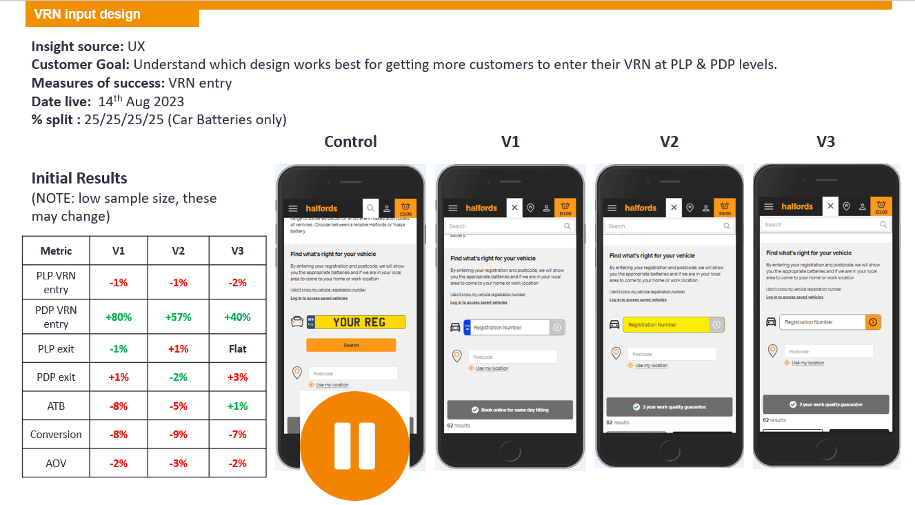
A user's needs can only be fully met when they have given their Vehicle Registration Number (VRN) and postcode - the VRN journey has a potential value of £1m. Our aim was to increase the rate of VRN and postcode entry by 8%-10% overall. Contentsquare analysis had shown that customer frustration was high when it came to entering their VRN and postcode – user experiences ranged from dead-end journeys to redirects and non-clickable items. At the same time, they may want to just get browsing, fix their immediate problem and move on. Halfords’ offer is complex: products or services; fitted or fit-it-yourself - and any combination of the four. Entering the VRN and postcode unlocks multiple user journeys so the data entry fields had to be more integrated in a variety of pages while also making the action more compelling to increase the completion rate. By the time the redesign was signed off it had out-performed the original in an initial test by 80% - entry of the VRN on the Batteries PDP page.
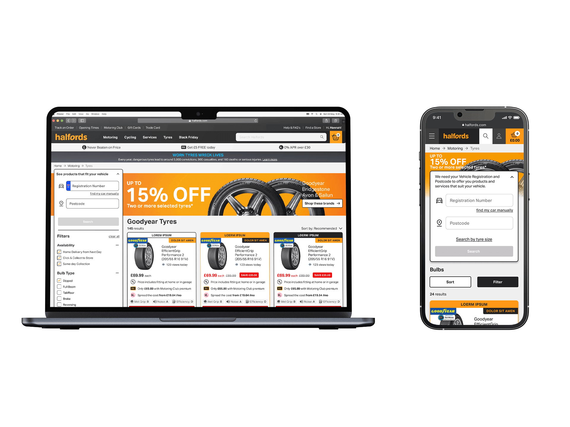
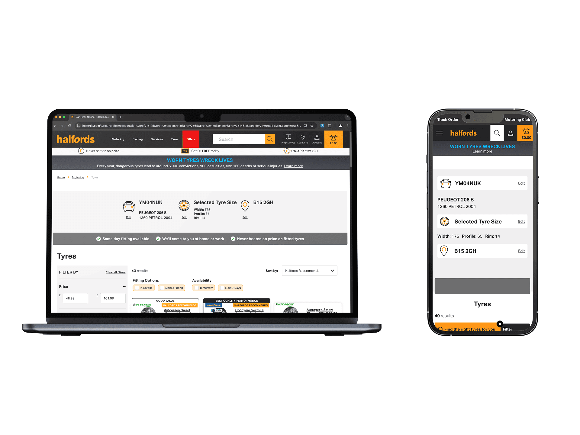
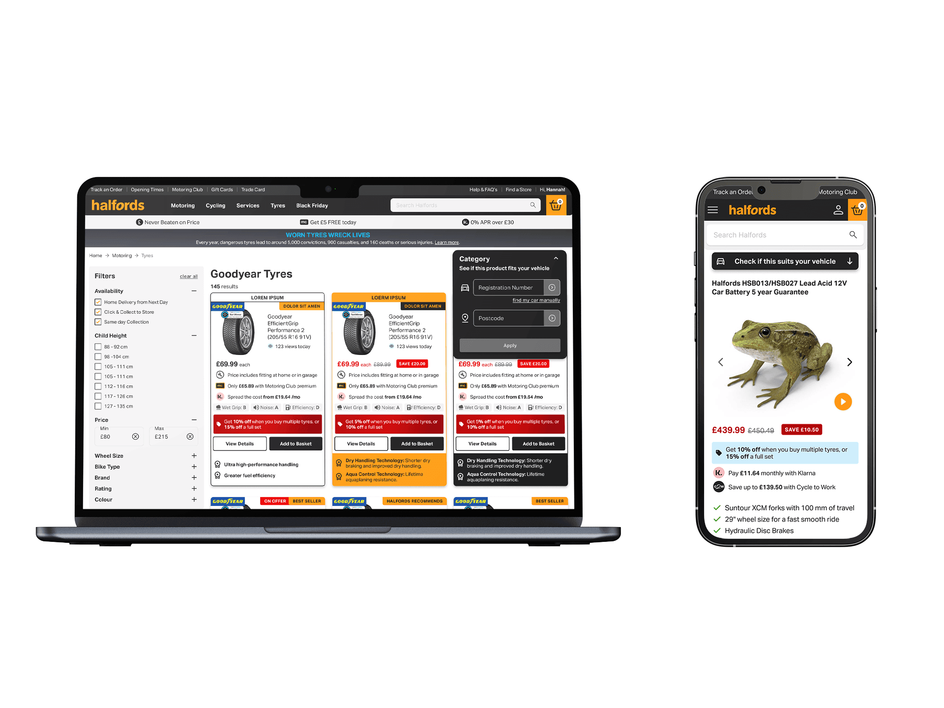
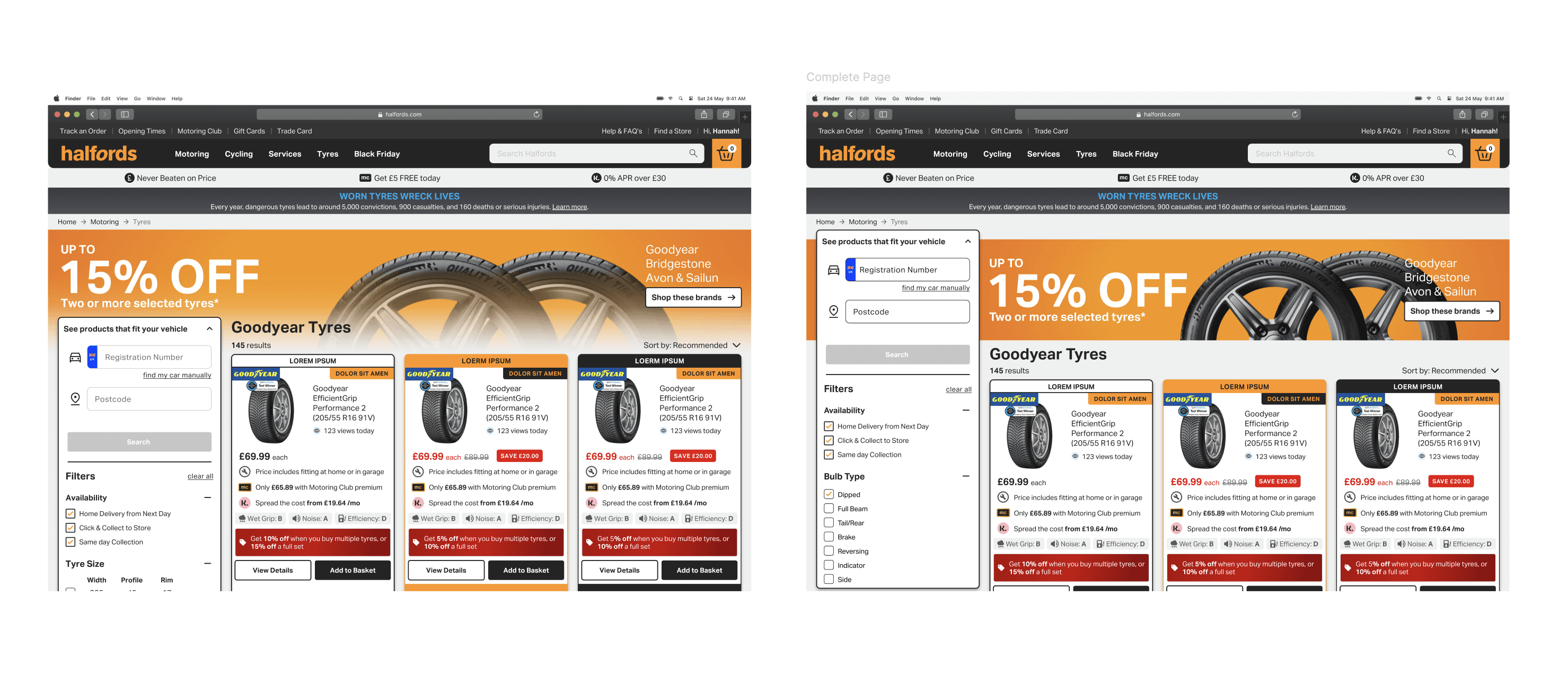
Prototype of new VRN/postcode entry applied in tyre selection journey
Final Redesign
The existing design for data capture was eye-catching, but taking up a lot of real estate, pushing material below the fold and competing for attention with product content. As the VRN and postcode data is not mandatory for all user journeys, the dominance of the data entry fields came with its own lost opportunity cost. Also, the data entry fields are one-time use only: once the data is entered the fields no longer need to be visible, but in the existing design those fields remained throughout the journey. Importantly, the conversion rates for users who did enter their VRN/postcode were significantly higher than those who didn’t, making the data entry a high-value CTA even though it was not a universally mandatory step.
This was a complex UX and UI re-design task carried out by one value stream team and impacting all other value streams, plus a wide range of internal stakeholders. Added to this, I was inheriting the work from other UX designers and was under a tight timeline to bring together past efforts, re-design for the current brief, test and manage all the stakeholder expectations ready for development.
Original Design
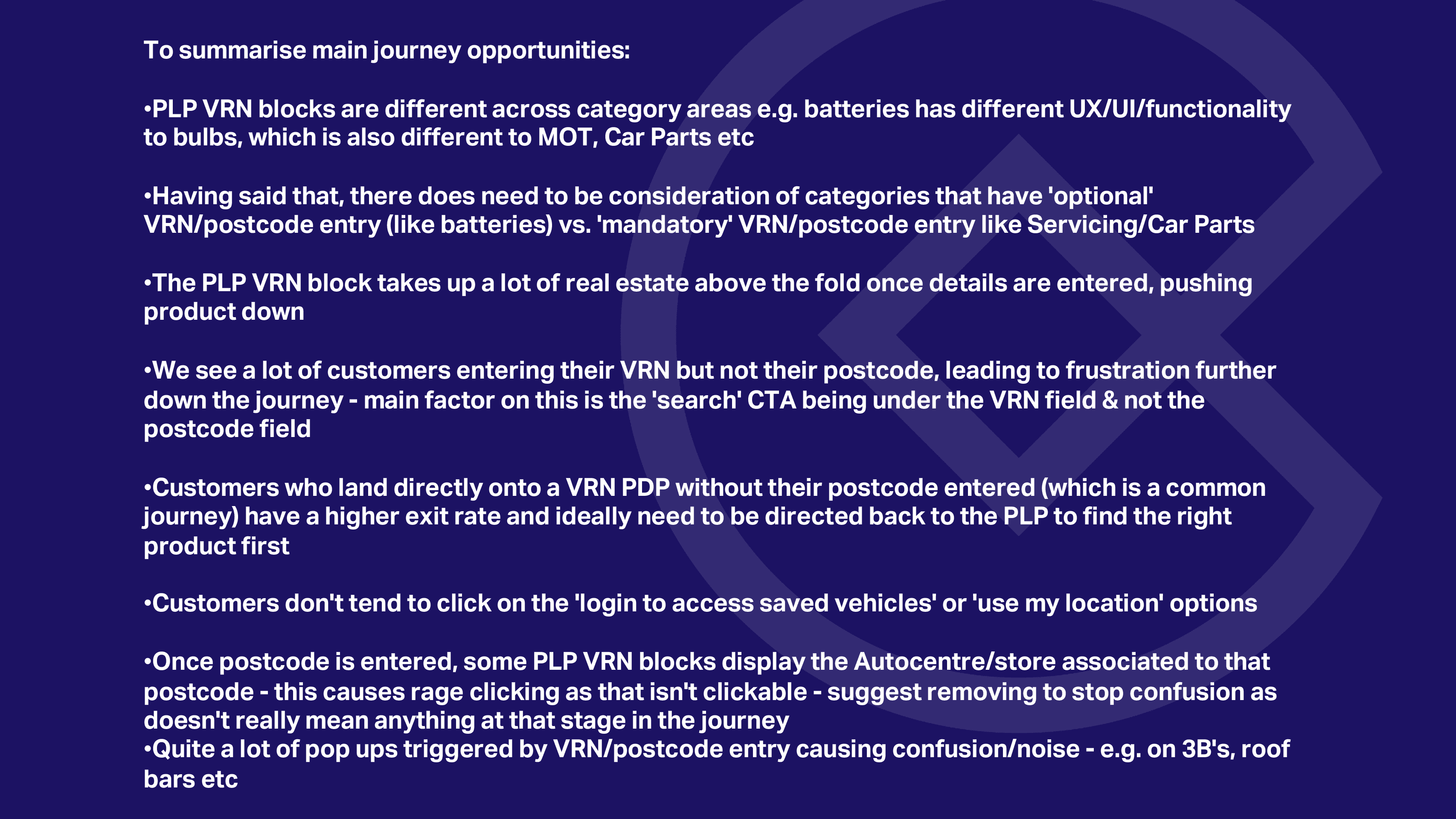
I went back into Contentsquare and interrogated the analystics I’d been given further. Running through various user journeys gave me a nuanced feel for the pain points users were experiencing. This insight was essential to fully appreciate the complexity of the VRN/postcode implications for optimizing online purchasing processes. It was clear that users who did enter their VRN/postcode were not encountering as many obstacles in their search for a product or service appropriate to their vehicle or location. From a heuristics perspective it was also important to reassure the user that their search was being driven by the correct VRN/postcode. These insights informed my design decisions.
Stakeholder Presentation
Checking Out the Competition
This data entry issue is common across sites related to vehicles, be it car tax, insurance or other maintenance services. I explored the approaches taken by others in the sector. There was a lot of similarity across the sector with most competing companies having accepted the dominance of the data entry fields over product display – spreading the data entry field across the screen. Some made at least the VRN entry mandatory before beginning the user journey.
Our aim was to make the VRN/postcode entry area integral to many diverse pages without letting it either diasppear or overwhelm other content. We were committed to creating a stand out design through ideation and iteration to make something better than we had seen so far.
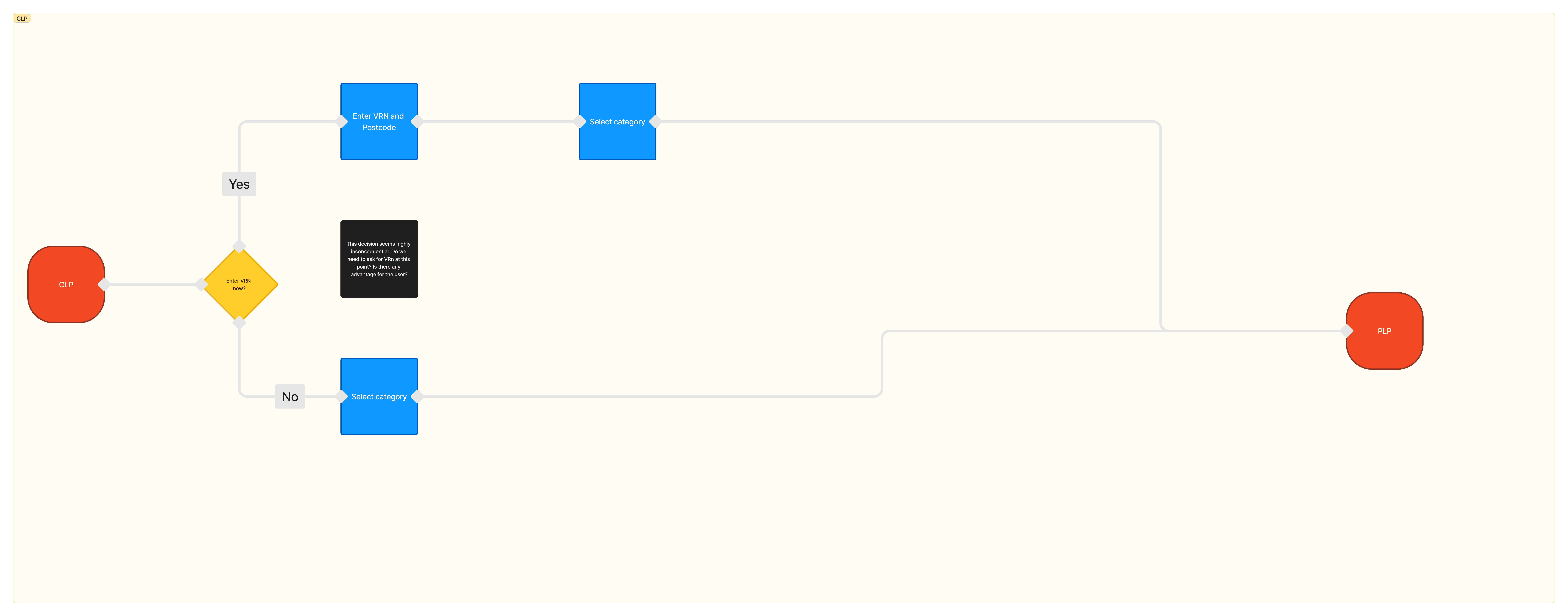
Category Listing Page (CLP)
At the highest level of entry, CLP, the user may not even know what products or services they’re in the market for and some may be able to complete a journey that doesn’t ever need VRN or postcode data to be entered. However, when that data is necessary, we want to avoid re-directing a user to enter data once they’re way into their journey or, worse still, letting them reach a ‘not available in your area’ or ‘not suited to your vehicle’ message after detailed browsing!
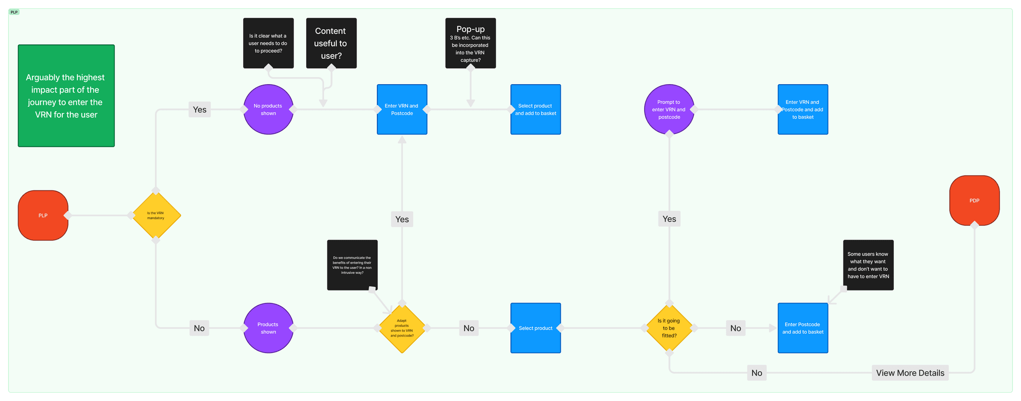
Product Listing Page (PLP)
The Product Listing Page presents the most complexities as there are multiple journey options, giving rise to many design questions:
When the VRN/postcode data is mandatory – does the user quickly see what is needed for them to proceed (e.g. car tyres)?
When the data is optional (e.g. car batteries) – is the value of entering the VRN/postcode evident to the user? For example, they may eventually want the battery fitted and need to know if that service is in their area.
When additional data is needed (e.g. sizes, options for fittings) – should the prompt for more information pop up or can it be incorporated with the VRN/postcode fields?
Will an expert user be satisfied – how do we optimize the journey for users who already know exactly what they need for their vehicle, have bought before or want to buy products for a non-motoring purpose?
Product Listing Page User Flow
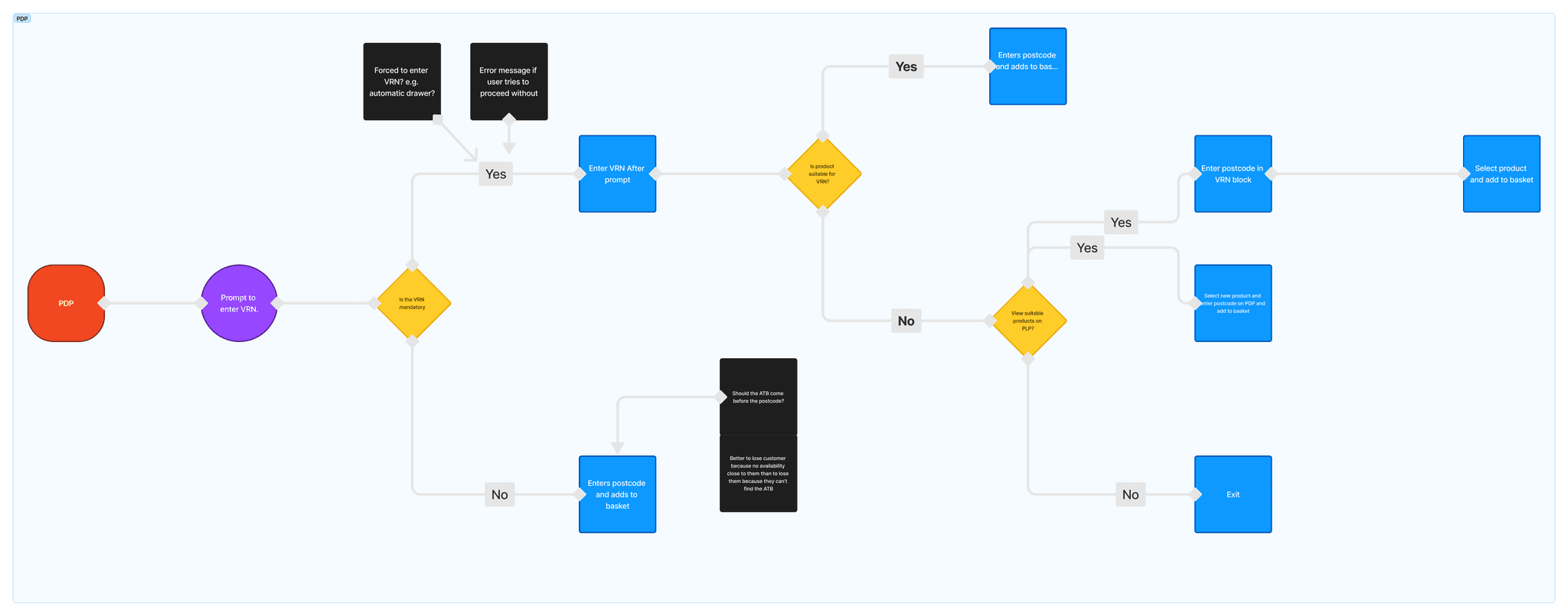
Product Description Page (PDP)
The cost of users exiting is highest in the PDPs. The majority of users enter these pages from Pay Per Click (PPC) routes and will be deep into specific product information without having been prompted to enter their VRN/postcode. The risk of a futile search for a product or service that is not suited to their vehicle or not provided in their area is high in this journey.
Product Description Page User Flow
Consultation is a two-way street with many groups, such as merchandising, ecommerce, proposition and product owners, having their own perspectives and buisiness needs to consider. Some stakeholders brought their own evidence and data to the table, while others wanted to see our test results. I gathered ideas and experiences with the VRN from all these groups, including across other value chains, especially to know how other user journeys link to mine and applied the information to create decision trees and user flows based on key pages in the user journey and how VRN interacts with them. A critical consideration was balancing the concerns of the ecommerce group with the functionality from a user journey perspective. User testing (see above) made it possible to ensure that well-founded design decisions were not overturned without considering the research path that had been followed.
Reviewing previous design attempts was a good opportunity to see how others had tried to update the VRN fields before me. While some ideas were interesting, those designers hadn’t had the brief to explore the full extent of the VRN and all its variations within Halfords’ online presence. I was able to take some elements from their thinking into my design process.
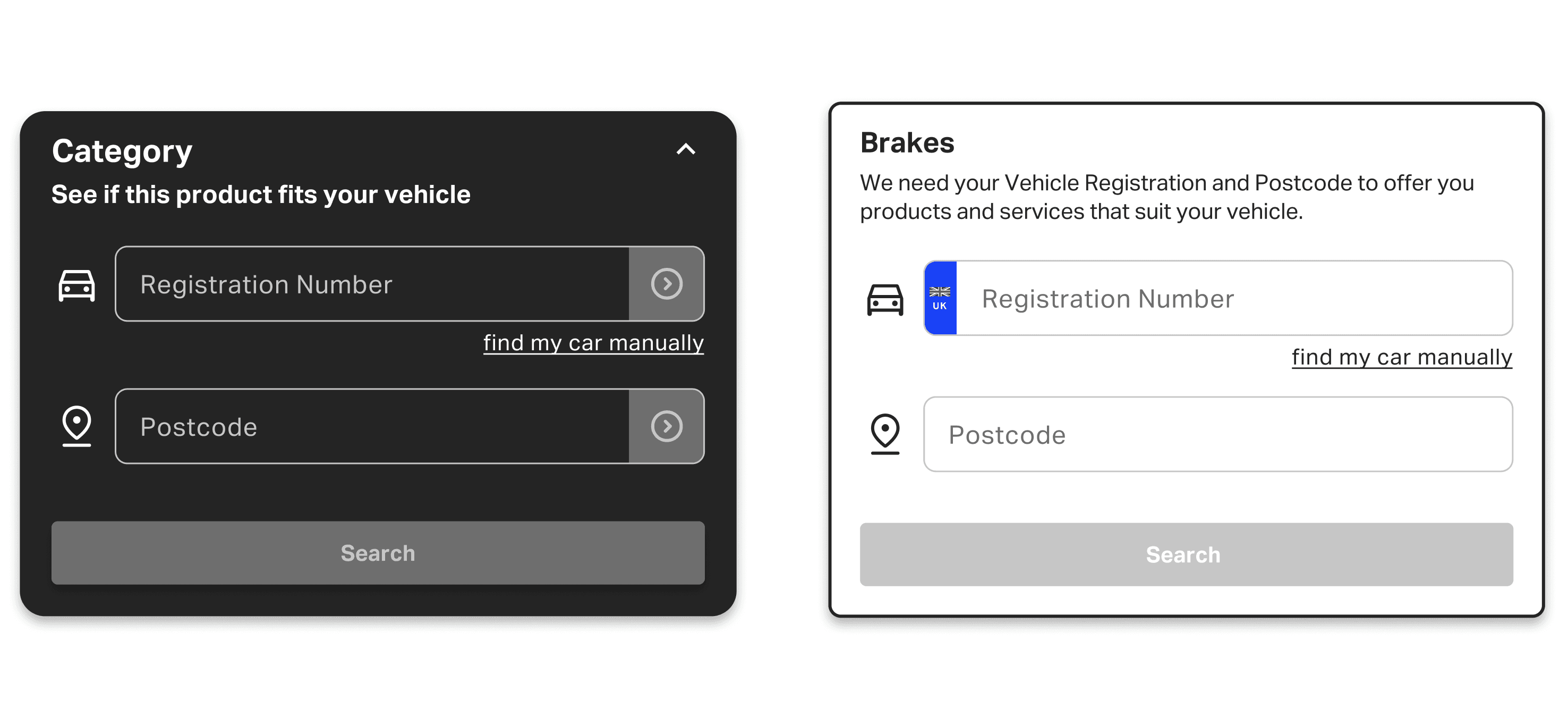
In my initial design decisions I wanted to make the VRN block feel more modern and inline with our current design aesthetics. This meant having a simple, clean design that was recognisable without overpowering other elements of the page. I began with a bold look in black to address the data that said some users overlooked the VRN field entry. Initially I designed this as a consistent global element that would maintain its place in the hierarchy across all pages. I wanted to establish the VRN block in a consistent position that would not disturb other elements on the different pages that the block would appear on. It was also important that the design of the block could show consistency when adapted for different devices.
Iteration One
It was important to expose these initial ideas to comment and feedback. While the visual style I had arrived at was appreciated from a design perspective, the UX design lead felt that the black background was a step too far in Halfords’ design journey and questioned the feasibility of the global positioning. The new challenge was to find a design solution that would integrate the VRN into each page and to make it part of each step of the journey. First I explored different options to the black background.
Exploring Different Backgrounds
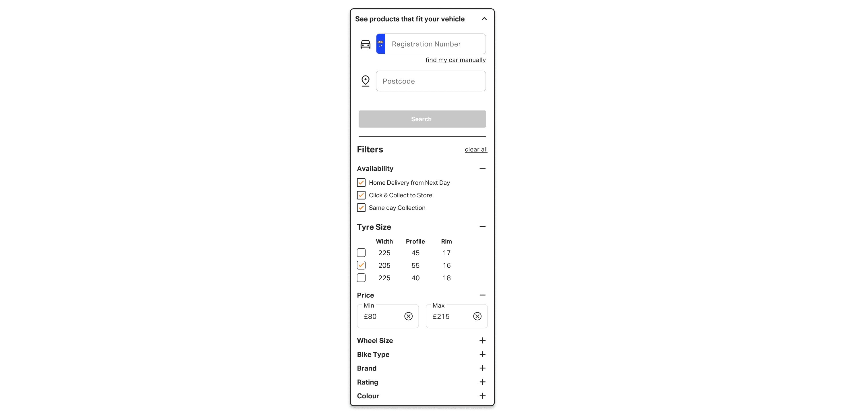
At this time I was focusing on the PLP as this was one of the most important and challenging places to integrate the VRN block. After experimenting with different layouts and placements, my next iteration was to treat the VRN like a high-level filter and embed it within the existing left-hand filter block on the PLP page.
Integrating VRN With Filter Block
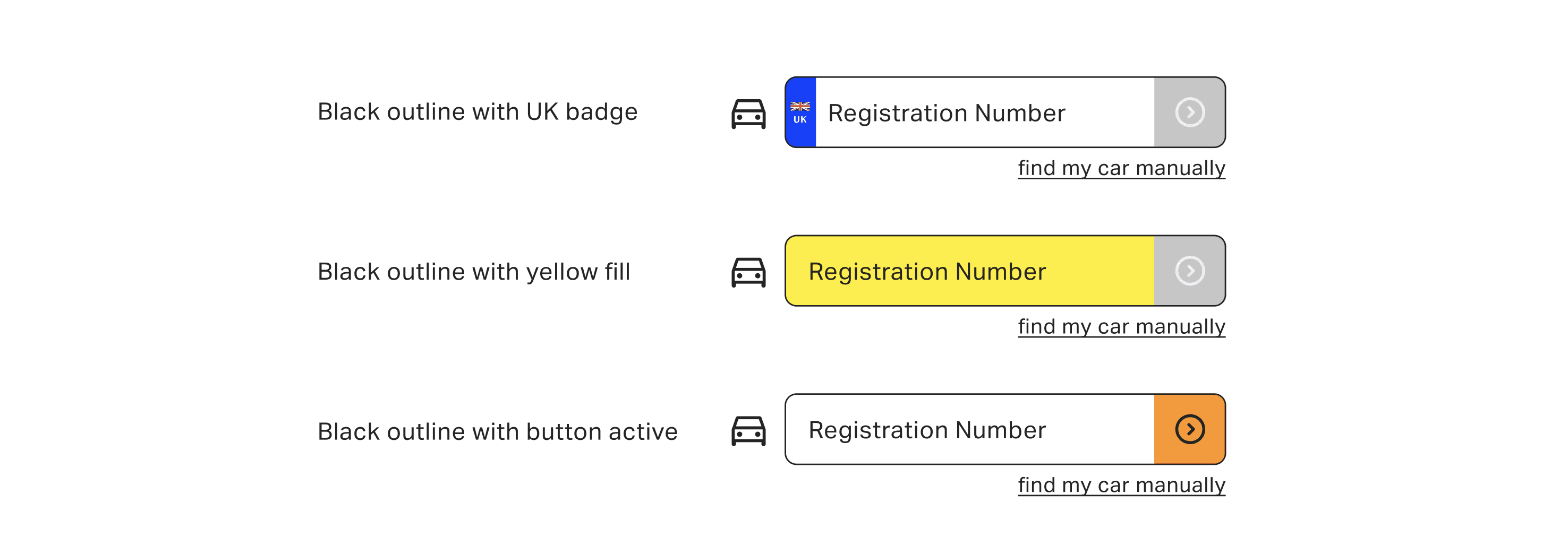
After initial testing among small groups, the data showed that the pre-existing version of the actual VRN field was outperforming the simpler new design. I went back to the original version, isolated three of its key visual elements (blue flag, yellow background, brand-orange button), generated three variations of the new design - each one incorporating a different key visual element - and tested them against each other. The tests showed that the visual elements performed differently from each other. By incorporating the strongest visual element from the live design (i.e. the blue flag) into the new design, I combined all the design strengths and achieved substantially increased performance rates.
VRN Field Variations
Throughout this design process I was playing both a UX and UI role. All my UI work is in Figma and I enjoy ‘sweating the small stuff’. In this case, along with the ideation, iteration and testing, I was carrying out all the UI-based decisions and using Figma to build and prototype the designs. This involved building components and nesting them as well as building variations for the landing, PLP, CLP and PDP pages.
Nested Components
It was important to take a holistic view at this point, which included branding, so I collaborated with the marketing team to create opporunities for promotion and marketing material. This focused on the inclusion of a hero banner at the top of the page, which allowed us to create themes for some pages and also allowed us to gather promotional content from individual product tile cards in one place. A second iteration process was necessary to explore and compare different variations (e.g. gradient vs non-gradient) to optimize the promotional effects.
Promotional Banner Variations
Prototype and testing
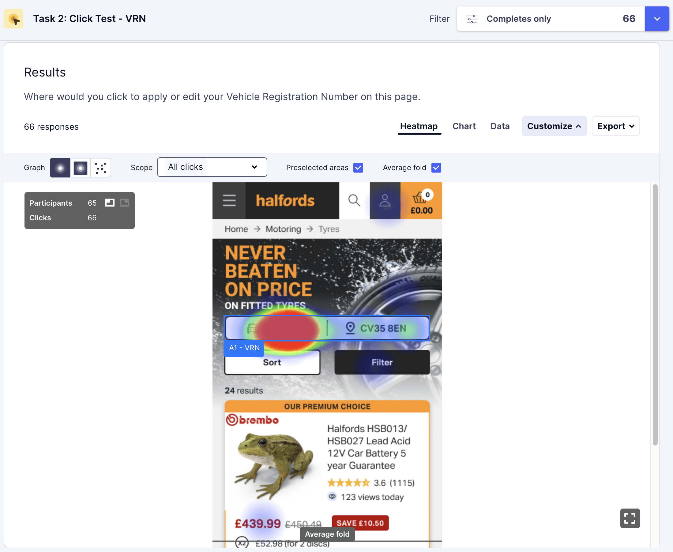
Click Test
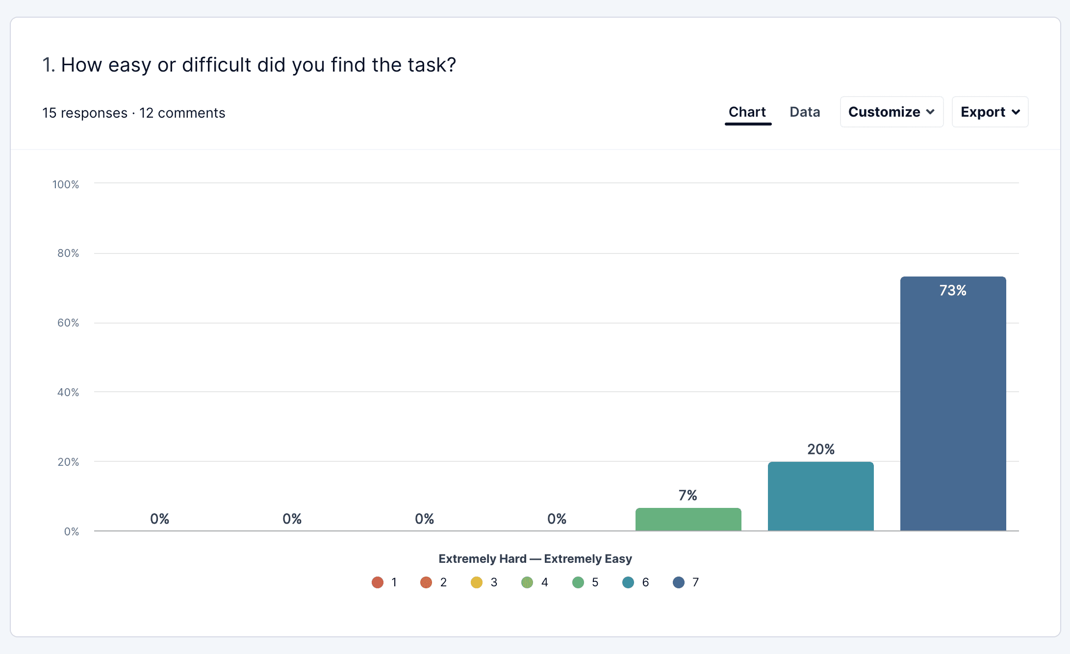
Trying to see if users would recognise the new location of the VRN on mobile as this was the biggest departure from the original design.
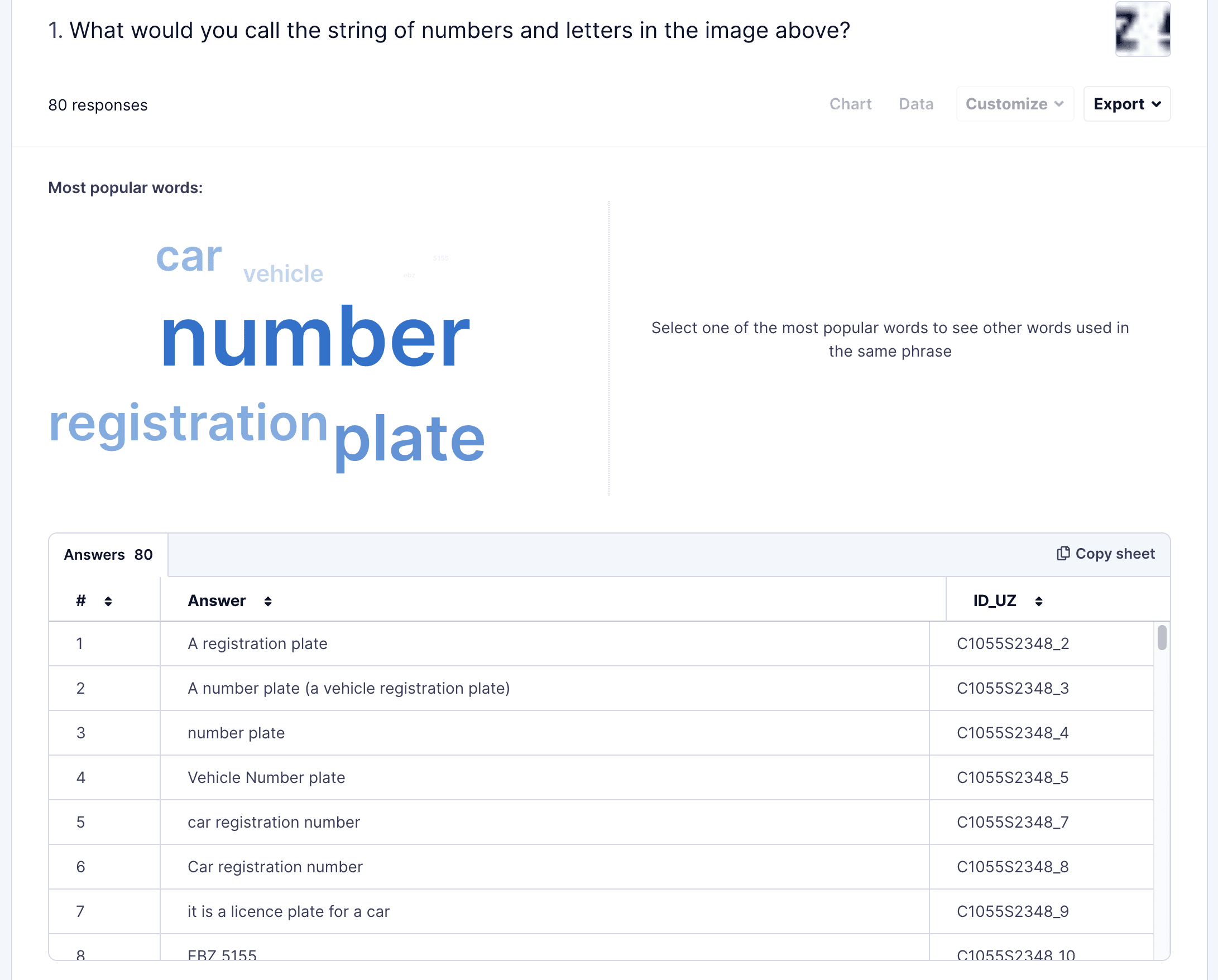
Terminology Survey
Trying to see if users would recognise the new location of the VRN on mobile as this was the biggest departure from the original design.
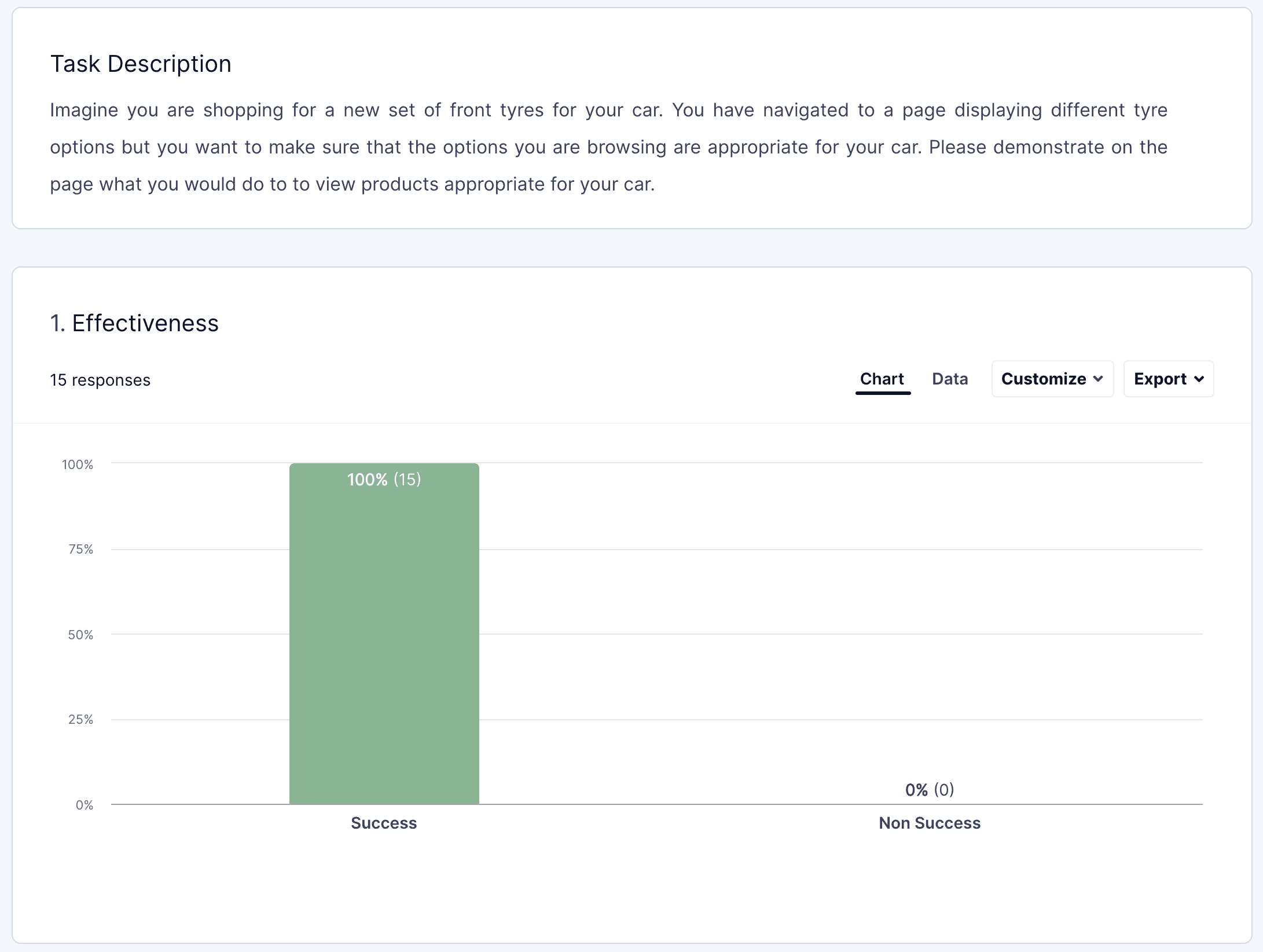
Basic Journey (non -cached)
Mandatory VRN-entry journey that requires users to enter VRN in order to view products. Testing whether users understood and found it easy to use the new design.
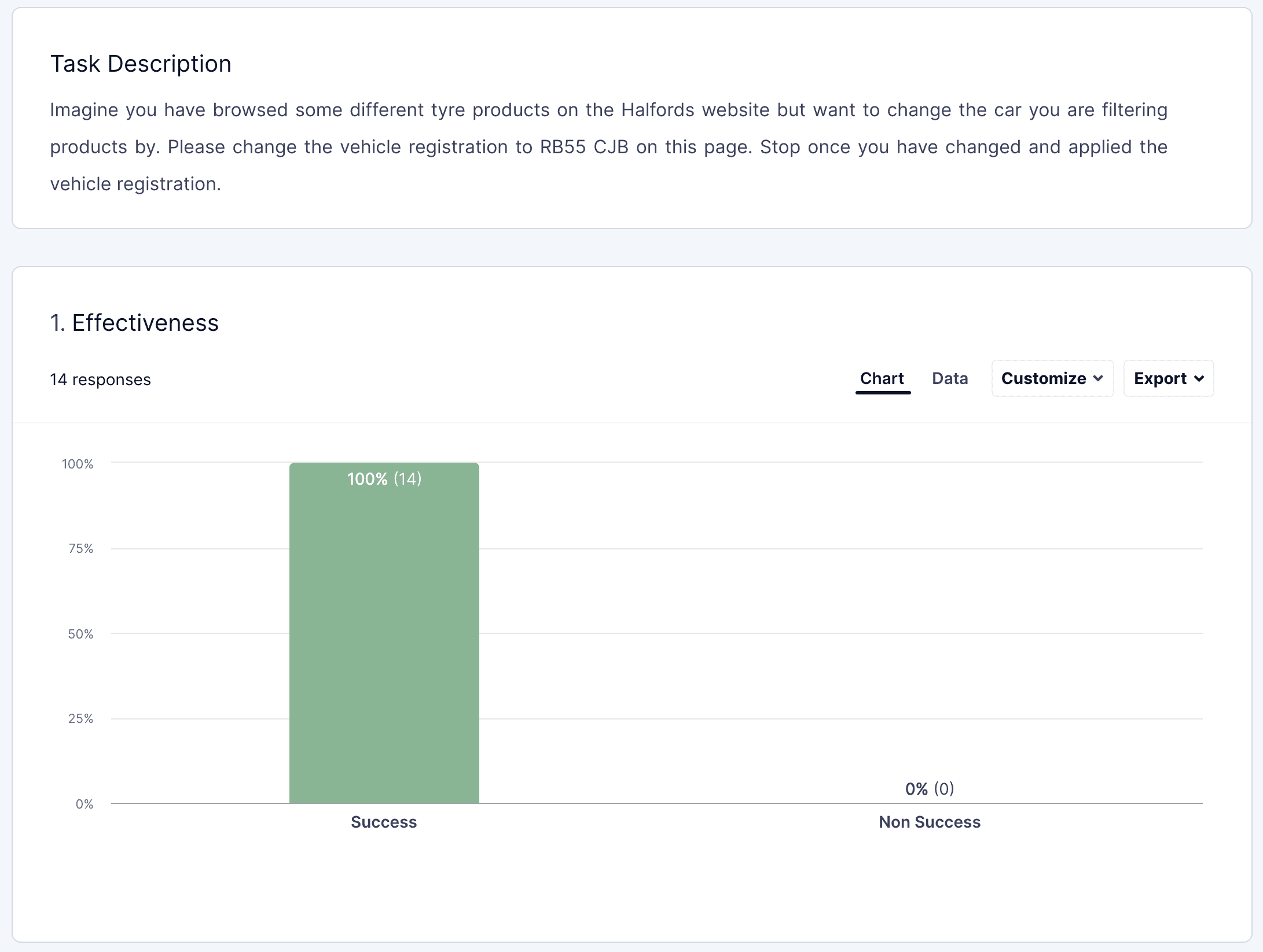
Basic Journey (cached)
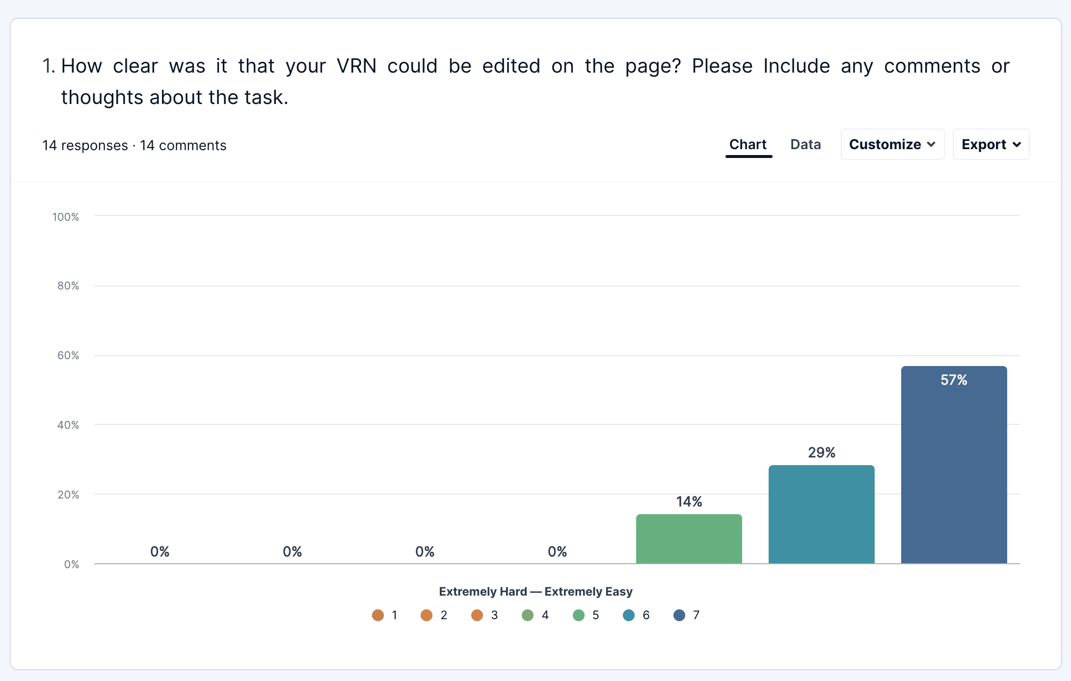
Situation where users have entered their VRN or it has been cached from their previous visit and they then wish to change it.
Presenting to, and working alongside developers involved ironing out issues and working on finding solutions when we met technical limitations or challenges. This is another crucial step in the process, working closely with developers in the hand-off process means you have to get further into the design details - the design is tested yet again by the technological needs to bring the project to completion and going live.
The work on VRN is not yet live, but as we have baseline multivariant test showing such strong results, I have high hopes for substantial and significant quantitative changes. The bar has been set high by my previous work on the Car Parts CLP: after that redesign, the conversion rates increased by 4.3% and the rate of direct progress to the PLP pages increased by 262%! Once live, further performance monitoring against key metrics will be needed to check whether the intended effects have been realised. I’m looking forward to this next stage!
